
How to Choose Aspect Ratios for AI Cartoon Images
Most people think about style first. Anime or Pixar-like? Soft shading or bold outlines? But when you are turning a photo into a cartoon, the ratio choice can matter just as much as the style choice. It decides how much of the face stays visible, how much background survives, and where the final image can be reused.
That is why the ratio setting matters before you click generate. The site already lets users choose aspect ratio up front, which is far better than guessing now and cropping away the important parts later.
A flexible photo to cartoon tool becomes much easier to use when you decide the destination first. Are you making a profile picture, a post image, a banner, or a shared preview image? The best ratio depends on that answer.
Why Ratio Choice Matters Before You Click Generate
Why square crops protect face clarity in small profile images
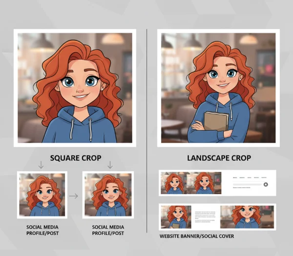
Square is usually the safest choice when the final image will be seen small. That is one reason square crops keep showing up in avatars, icons, and profile cards. They center attention on the face and reduce the chance that the important part of the cartoon gets pushed to an edge.
X's Summary Card docs use a 1:1 image ratio. They allow images from 144 x 144 up to 4096 x 4096, with a file size under 5 MB (X Summary Card docs). Even if you are not publishing to X, that guidance points to a broader truth: square formats are dependable when you want a clean subject-first read.
That is why a cartoon avatar generator often works best with square framing when the main subject is one face or one pet. You are giving the generator less room to waste on extra background and more room to preserve expression.
When square is too tight for props, pets, or full-body photos
Square is not always the winner. If the photo includes a skateboard, guitar, costume, pet pair, or full-body pose, square can become cramped quickly. It may cut off the object that makes the cartoon interesting.
This is where ratio becomes a storytelling choice. A tight square says, "focus on the face." A wider frame says the scene matters too. If the prop or pose carries the idea, do not force it into a headshot crop.
When Landscape Ratios Work Better Than Square
Shared previews, article cards, and banner-friendly layouts
Landscape ratios make more sense when the image has to live inside wide cards, article previews, or banner-like surfaces. Meta's Open Graph image guidance recommends using images that are at least 1200 x 630 pixels for high-resolution displays (Meta Open Graph image docs). That size is wide for a reason: social previews usually want breathing room around the main subject.
If you already know the cartoon will be used in a blog post card, creator promo, or link preview, a landscape output gives you more flexibility from the start. A cartoon image workflow is smoother when the first generation already resembles the final surface instead of fighting it.
Why landscape needs safer side margins around the subject
The tradeoff is obvious. Wide images give you room, but they also tempt you to place the subject too close to one side. That can create awkward crops later if different platforms trim the edges differently.
A safer approach is to keep the face or main figure slightly closer to center than you think you need. Treat the left and right edges as flexible space, not sacred space. That gives the image a better chance of surviving repurposing without cutting off ears, hair, or props. Portrait ratios can also be useful when the full character matters more than the surrounding scene. If the goal is a story post, a phone wallpaper, or a full-body cartoon reveal, a taller frame can preserve legs, outfits, and hand gestures that a square crop would lose.
How to Choose a Ratio Based on Reuse, Not Guesswork
A quick planning checklist before you upload the photo
Before you generate, ask 3 simple questions. Will this image mostly be seen small or wide? Is the face the only thing that matters, or do you need background and props too? Do you want one output for a social avatar, or one that can also be reused in article cards and promotional images?
Google Search Central says large images should be at least 1200 pixels wide for larger previews (Google Search Central docs). That is a useful reminder that reuse starts with planning. If a wide preview is part of the goal, choose a ratio that gives you enough width from the beginning.
A simple rule works well. Use square when the cartoon is mainly for avatars and tight profile use. Use landscape when the cartoon needs to breathe inside cards, headers, or shared content previews. If you are unsure, generate for the most restrictive use first, then make a second version for wider layouts. That small planning step often saves more time than fixing awkward crops after the file is already exported.
What to Remember Before Generating Your Final Cartoon Image
Style gets attention, but ratio decides usability. The best cartoon image is not only fun to look at. It also fits the place where you actually plan to use it.
That is why the smartest workflow is to choose the destination before the style lock-in happens. A square cartoon can be perfect for a profile image. A wide cartoon can be much better for banners and content previews. The right answer depends on reuse, not preference alone.
If you want fewer failed generations, start with the surface, then pick the ratio, then choose the style. That order usually leads to a result you can actually keep. It also makes it easier to build a second version later without restarting the whole cartoon workflow from zero. Planning first wins, especially on mobile.